Create and manage a brand: Floutel
From idea to identity
Creating a brand is not just designing a logo or choosing a color palette: it’s building a language that connects with people, a promise that is recognized even before it’s read.
That was the starting point for Floutel, a new Catalan telecommunications operator backed by Manix Capital, created with the goal of offering fiber and mobile services with transparency, energy, and attitude.
At Xarxalia, we took on the challenge from the very first minute: creating a brand from scratch, guiding Floutel through every stage —from the idea and naming to design, communication, and digital strategy.
The project allowed us to combine creativity, technology, and strategic vision to bring to life a brand that, rather than simply selling connectivity, invites you to flow.
The design team, led by Adrià Guiteras, worked side by side with founders Meritxell Bautista and Josep Olivet to transform a concept into a complete, coherent, and visually powerful identity.
From there, we built a solid structure: trademark registration, brand guidelines, web development, media presence, and social media.
Floutel was not born from a rebranding: it was born from a new, fresh, and purposeful idea.
A brand created from its very DNA to speak the language of a generation that wants to connect without complications.
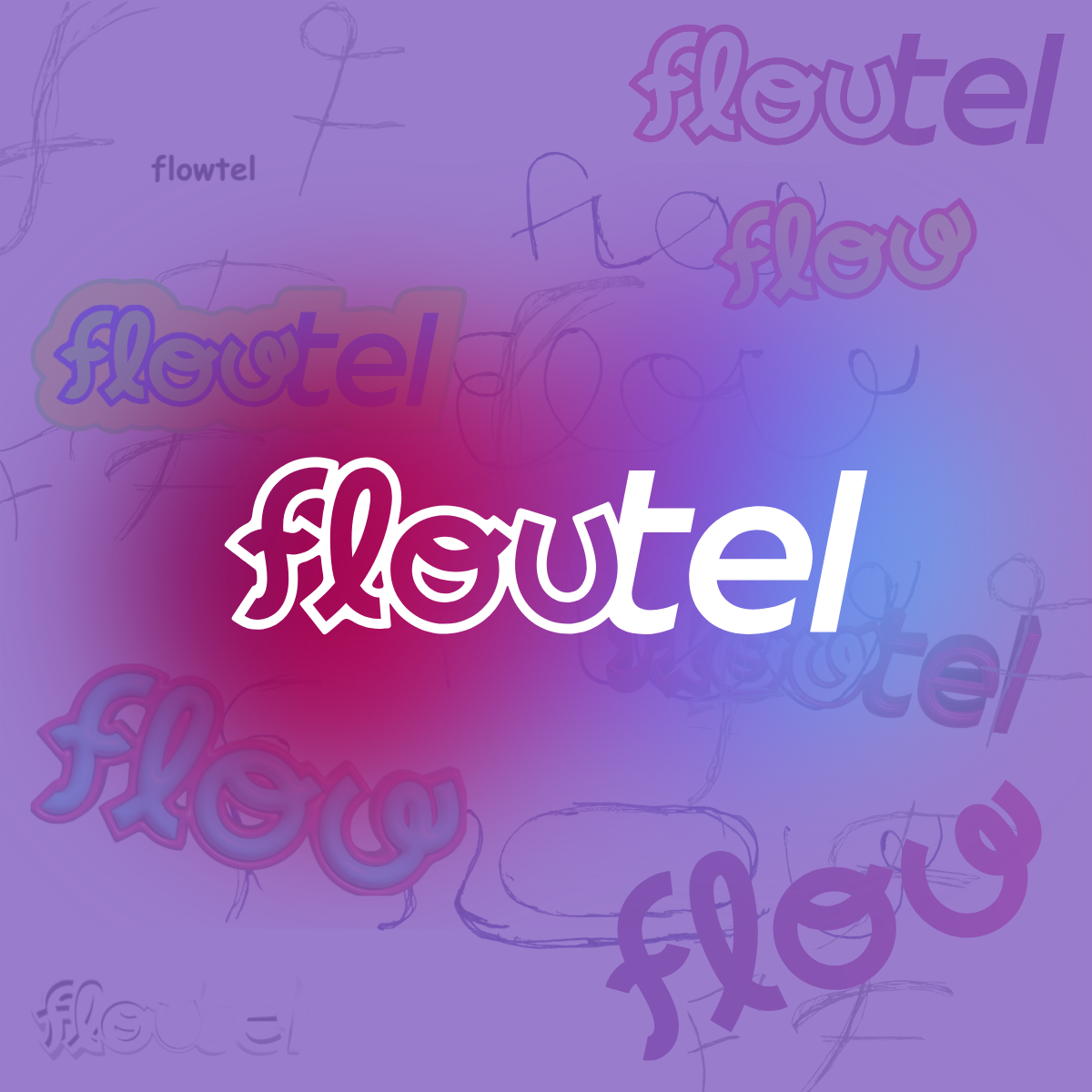
The creation of the identity – from concept to logo
Every brand is born from an idea, but it only becomes an identity when that idea finds form, rhythm, and personality.
In Floutel’s case, that creative process was a balance between the strategic vision of its founders —Meritxell Bautista and Josep Olivet— and the artistic direction of Adrià Guiteras, Xarxalia’s designer.
From concept to design: finding the flow
The name Floutel emerged as a play on words between flow and telco, a blend of attitude and technology that conveyed from the very beginning the essence of the brand: an operator that connects naturally, without rigidity or excessive formality.
The goal was to create a brand that stood out not only for pricing or service, but for its energy, language, and style.
Adrià Guiteras developed the logo design based on that idea of fluidity and movement.
The O in Floutel became the starting point for the entire visual system: an open, circular, ever-changing symbol that represents continuous connection and the dynamism of modern communication.
The initial design played with a u that approached a w, reinforcing the play between flow and flu, but after several tests the decision was made to evolve toward a cleaner, more recognizable, and more versatile logo.
The “aesthetic” as a visual language
Floutel’s visual style doesn’t try to imitate the major telcos — it deliberately distances itself from them.
Inspired by aesthetic trends, the result is a light, minimalist, and expressive logo, with soft lines and spacing that conveys clarity and balance.
The colors —intense, energetic, and contrasting— reflect youth, freshness, and dynamism, three essential concepts in the brand’s narrative.
The typography was designed to be functional and modern, maintaining readability across all formats, from packaging to digital interfaces.
More than a visual identity, Floutel was conceived as an emotional visual language: every shape, color, and proportion needed to express closeness, optimism, and movement.
The result is a recognizable, flexible brand capable of adapting to new formats, from the SIM card to a TikTok campaign.
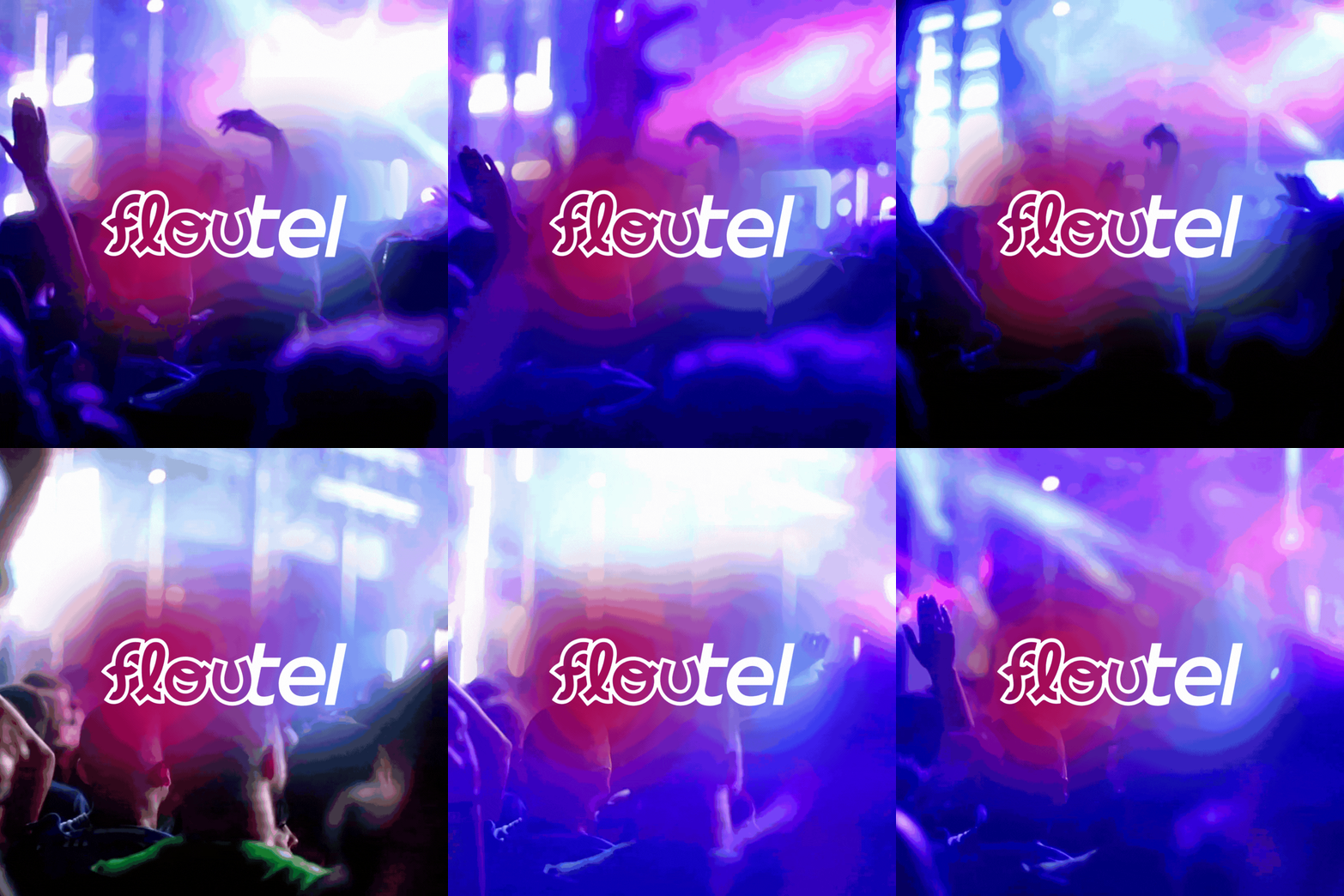
Building a brand beyond the logo
The logo is the visual starting point of any brand, but a strong identity is built far beyond its form.
At Xarxalia, we understand a brand as a complete ecosystem where every element —from packaging to tone of voice— reinforces a single message.
With Floutel, that was precisely the challenge: translating the flow in its name into every level of customer interaction.

Designing a coherent experience
From the first SIM cards to the shipping envelopes and post-sales communication, every detail needed to breathe the same visual and emotional style.
The aesthetic line we defined together with Adrià Guiteras was carefully applied across all physical materials: typography, color, composition, iconography, and microcopy.
The result was a recognizable visual universe, where everything communicates energy, closeness, and modernity — even in the smallest elements.
Consistency was also essential in the promotional and corporate materials:
- Packaging with its own identity, vibrant and clean, designed to convey enthusiasm from the very first physical contact.
- Technical documentation and welcome guides with clear, visual language.
- Adaptable graphic material, ready for campaigns, stands, and retail.
Language as part of the brand
But beyond aesthetics, it was essential to define how Floutel speaks.
At Xarxalia, we built a tone of voice that is friendly, young, and cleverly humorous, reflecting the essence of “flou.”
The messages needed to feel authentic, direct, and optimistic — far from the technical or impersonal language of major operators.
Every word was chosen to create an emotional connection:
instead of “activate your line,” we say “turn on your flow”;
instead of “technical support,” “talk to us.”
This verbal decision strengthened the brand identity, making Floutel sound and feel different — in its ads, on its website, and across its social media.
An ecosystem with personality
With all these elements —design, tone, experience, and consistency— Floutel stopped being an emerging operator and became a brand with soul.
An identity that can be felt across every touchpoint and that builds trust without giving up on fun.
Because building a brand is not about creating an image; it’s about creating a recognizable, repeatable emotion at every point of contact with the audience.
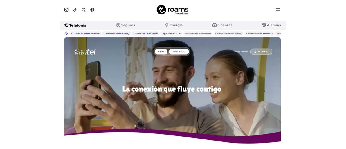
The website – the digital home of flow
If a brand is a conversation with the public, its website is the place where that conversation happens.
For Floutel, the website couldn’t just be a service showcase — it had to be a space that expressed its vibrant personality, freshness, and promise of simplicity.
At Xarxalia, we designed and developed a digital space that reflects the essence of “flou”: clean, direct, and uncomplicated.
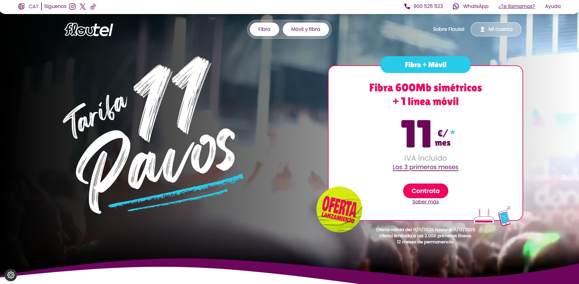
A design made to flow
The starting point was Floutel’s own manifesto — a declaration of principles that sums up the brand’s philosophy: “there are many ways to have flow.”
That idea was translated visually into a flexible design with subtle movements and an energetic color palette that conveys activity, youth, and confidence.
Navigation had to be intuitive and fast, with an organized information system so any user —technical or not— could understand the plans, services, and advantages effortlessly.
Each page was built without pre-designed templates, using custom code and light animations inspired by the movement of the logo.
The result is a unique, coherent, high-performance digital environment, optimized for SEO and loading speed, where aesthetics and functionality live in balance.
See the Pen Llaç Floutel by Ramon Heredia (@Ramon-Heredia) on CodePen.
A user-centered architecture
The site’s structure was designed with a simple, transparent conversion funnel logic.
Users arrive, understand the offer, and sign up in just a few steps.
From the first click, the website communicates closeness: the text is clear, the calls to action are honest, and the signup process is straightforward.
Scalability was also a priority: the architecture allows new services to be incorporated organically, integrating CRM, advanced analytics, and digital support tools for customers.
Flow in motion
Beyond the technical design, we wanted the user experience to convey rhythm.
Vibrant colors, micro scroll effects, and transition gestures create a sense of dynamism without distraction.
Flow isn’t only in the logo — it’s in every transition, every interaction, in the way information moves.
In short, Floutel’s website isn’t just its digital showcase — it’s its most honest visual expression.
A space where technology and design come together to reflect exactly what the brand promises: frictionless connection, with attitude and style.
Launch strategy – when the brand goes out into the world
A brand’s creation doesn’t end when the logo is designed or the website goes live.
The real test is the launch — the moment when the identity is revealed to the public for the first time and must uphold its promise before thousands of watchful eyes.
At Xarxalia, we knew that Floutel’s debut had to be as solid as its design and as vibrant as its personality.
A coordinated and strategic launch
The strategy began even before Floutel activated its first lines. The objective was clear: introduce the brand, explain its purpose, and generate media impact in a sector dominated by major operators.
To achieve this, we structured a three-phase communication plan:
1 - Expectation and positioning
We prepared the media and the digital ecosystem for the arrival of a young, bold, and different brand. It was essential to communicate that Floutel wasn’t launching to compete on price alone, but on attitude and value proposition.
2 - Official brand presentation
We coordinated the release of press notes and official communications with impeccable visual design and a direct message: “your flow, your way to connect.”
The narrative focused on transparency, smart humor, and the friendly language that defines Floutel.
3 - Massive media visibility
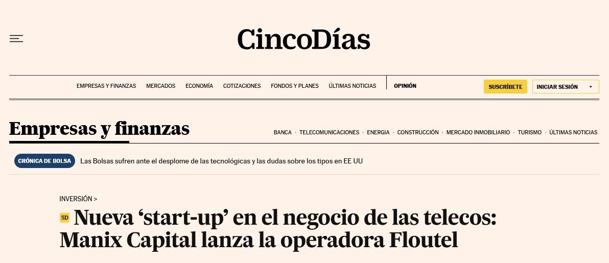
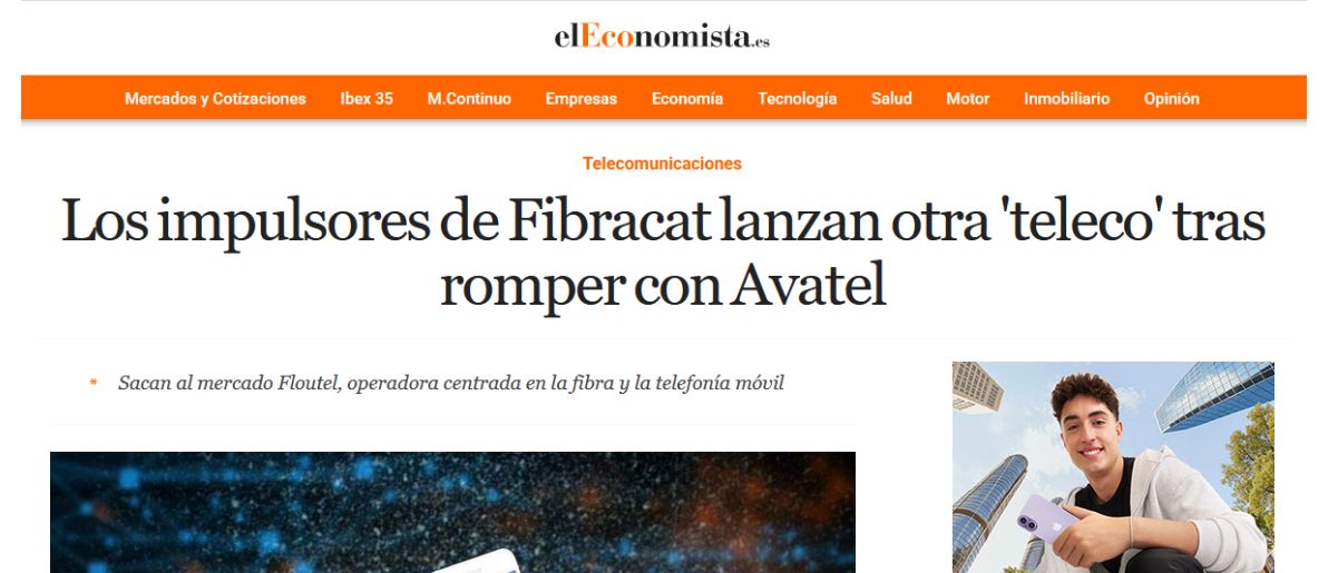
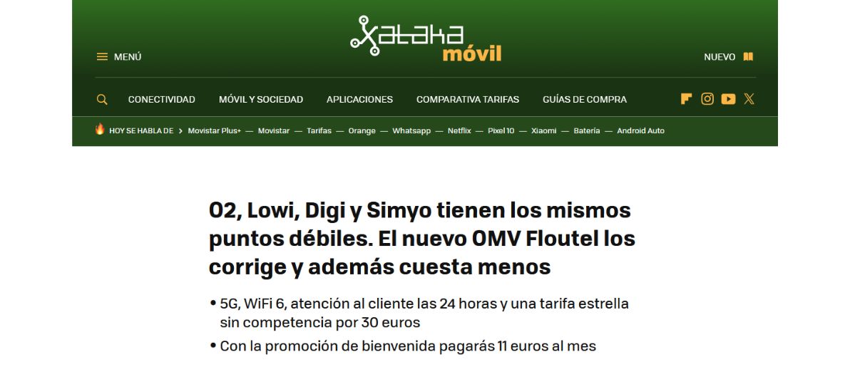
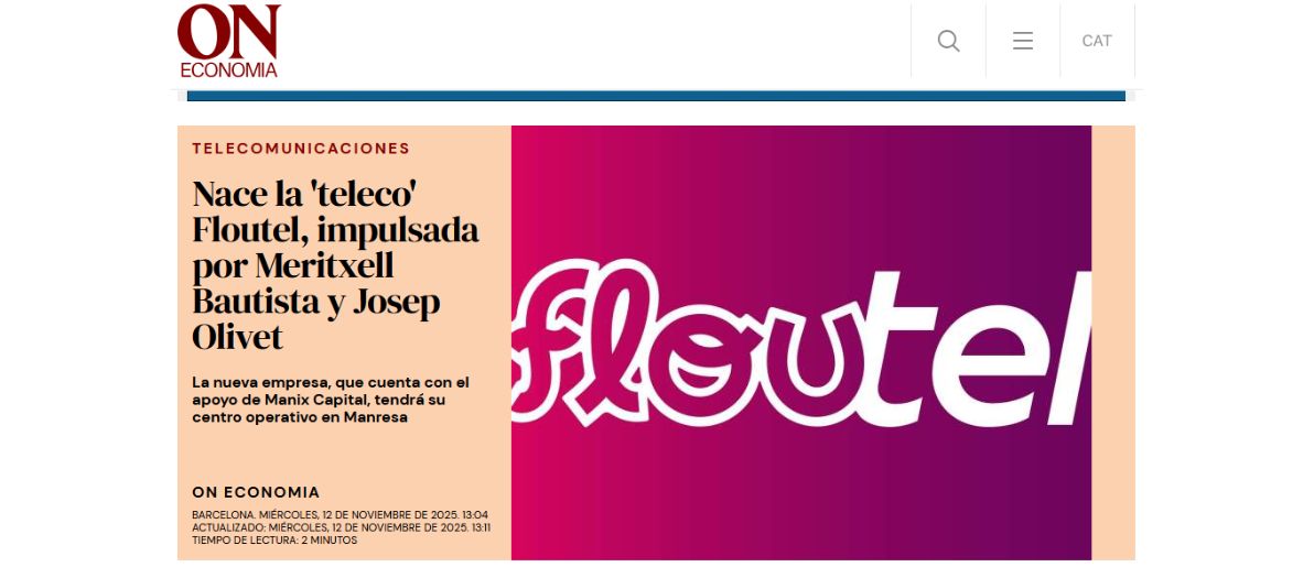
The impact was immediate. In the first few days, the brand appeared in national, regional, and tech-focused media:

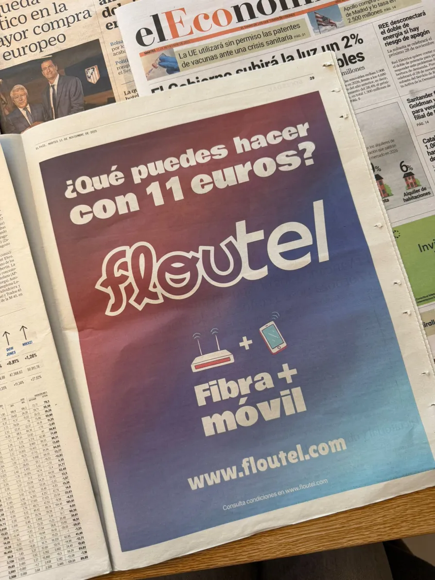
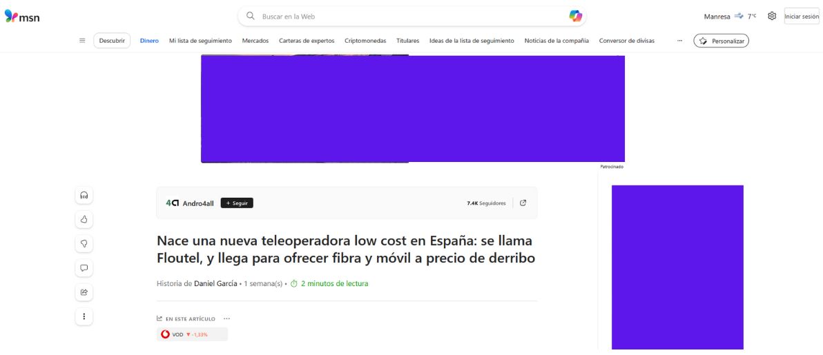
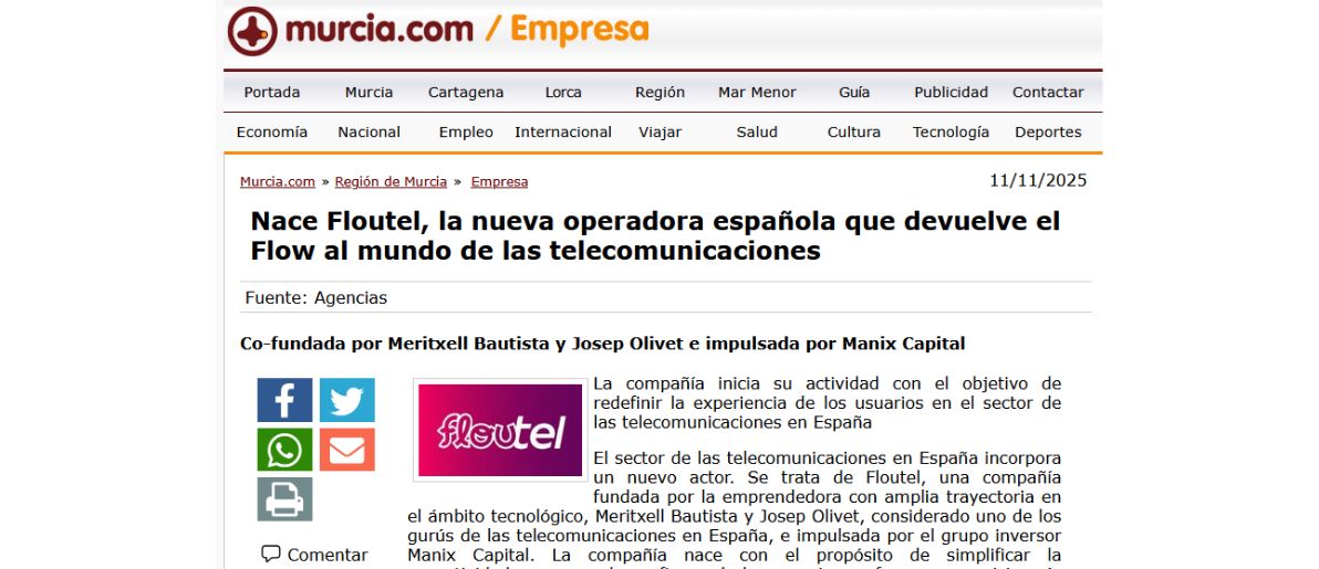
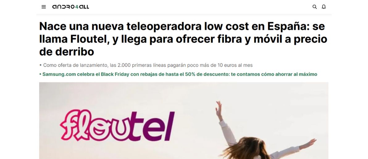
Full-page feature in El País

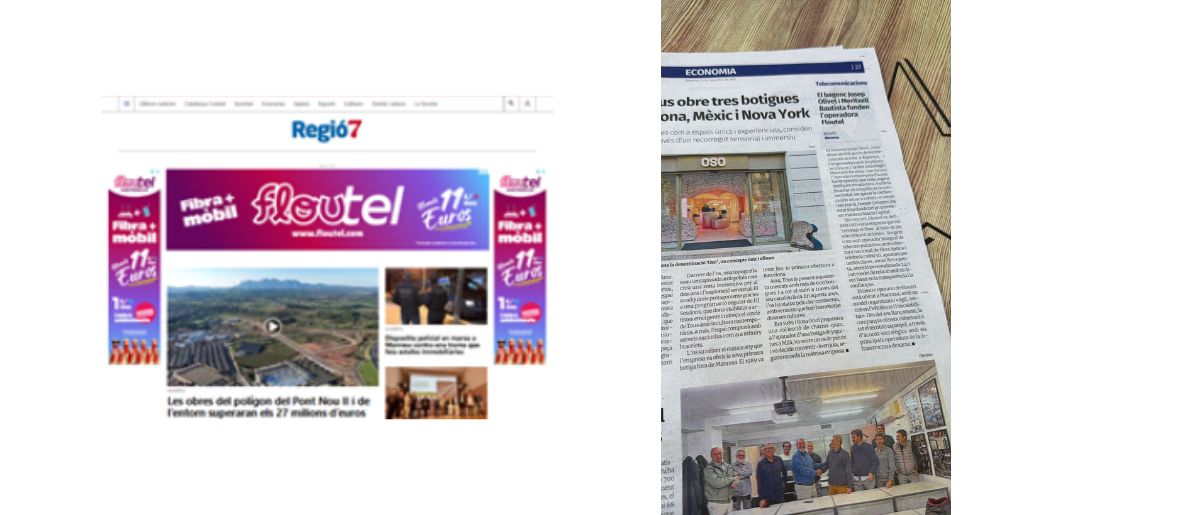
Regió 7, digital ads and featured Economy news in print media
This media coverage allowed Floutel to enter the market with a level of credibility far above what is typical for a newly launched brand.
First impressions matter
The launch was built on a key pillar: conveying personality from the very first second.
The fresh, confident, and relaxed tone wasn’t an experiment — it was a strategic decision to position Floutel as the young, modern, and transparent alternative within the telco ecosystem.
Every headline, interview, and publication reinforced the idea that Floutel was here to break the mold:
without unnecessary technical jargon,
without empty corporate language,
and without fear of standing out visually and verbally.
All of this ensured that the public’s first impressions were consistent with the brand we had built.
From theory to practice, Floutel presented itself to the world exactly as it should: fresh, bold, and full of flow.
Floutel’s digital present – a brand that flows
A brand doesn’t stay relevant because of how it launches, but because of how it evolves.
After the public presentation and initial media visibility, Floutel’s challenge was to consolidate its digital presence with its own style — recognizable on every platform.
At Xarxalia, we supported this evolution by defining a multichannel strategy where each social network reflects a different “side” of the brand, without losing its original essence: the flow.
TikTok, Twitter, and Threads: irreverence, relevance, and speed
On the most dynamic and spontaneous platforms, Floutel presents itself with a relaxed, fresh, no-filters tone.
Here, the brand speaks like its audience:
- quick humor
- cultural and viral references
- reactive content tied to current events
- short messages that create instant connection
The objective is not just to inform, but to entertain, surprise, and build community.
Floutel moves freely, without rigidity, proving that a telecom operator can have personality and attitude without falling into traditional corporate language.
Instagram: aesthetics, emotion, and visual connection
Instagram is the brand’s emotional showcase.
Here we work with a more aesthetic and sensitive image, where visual and aspirational elements take center stage.
Clean design, carefully curated compositions, and slower-paced messages help reinforce Floutel’s visual universe:
- vibrant colors
- clear typography
- modern compositions
- creative microcopy
It’s the place where the brand becomes more intimate, closer, and more “beautiful,” strengthening its visual bond with its community.
LinkedIn: professionalism without losing the flow
On LinkedIn, Floutel expresses itself with a more technical and strategic voice, aimed at industry professionals, partners, and business agents.
However, even here the brand preserves its essence:
- clear messaging
- direct language
- positioning as a young yet competent company
It’s the space where Floutel demonstrates its professional strength, its innovative capacity, and its future-focused vision within the telecommunications sector.
A coherence that flows across platforms
The most important aspect of Floutel’s digital presence is its narrative coherence.
Each social network expresses a different nuance:
- spontaneous on TikTok
- emotional on Instagram
- professional on LinkedIn
But in every case, the brand carries the same energy.
And that is essential for any modern identity:
letting its voice adapt without losing its essence.
Today, Floutel is a living, flexible brand, capable of moving between very different communities without creating dissonance.
That is the greatest indicator that the brand-building process was solid from the foundation, and that its daily management keeps intact the spirit it was born with.
Creating a brand is creating an experience
Building a brand is not a visual exercise, nor merely a technical project.
It is a deep, emotional, and strategic task where every decision —from a color to a single word— influences how people perceive, feel, and remember what we are creating.
Floutel is a clear example: a brand born from scratch that, thanks to a conscious and multidisciplinary process, became a living, coherent, and recognizable identity.
At Xarxalia, we accompanied the entire process:
the initial idea, the verbal essence, the logo, the packaging, the website, the social media presence, and the brand’s public narrative.
All with one clear premise: that every element should transmit the flow.
A flow understood not as a passing aesthetic, but as an attitude — the way a brand moves, expresses itself, connects, and adapts.
The joint work with Meritxell Bautista, Josep Olivet, and our designer Adrià Guiteras made it possible for every decision to be organic and aligned with a shared vision.
The result is a strong, flexible brand ready to grow.
A brand that is not only easy to recognize, but also easy to feel.
Today, Floutel is not just a young operator:
it is a communication style, a visual reference, a distinct value proposition within the telecom sector.
Its social presence, its website, its colors, and its tone are not isolated pieces; they are chapters of the same story.
And that is, in the end, the true objective of branding:
to create a complete experience, from beginning to end.
An experience where the user can say not only “I like this brand,” but “I understand who it is, what it represents, and how it wants to speak to me.”
At Xarxalia, we continue to believe that the brands that flow, evolve, and connect with authenticity are the ones that endure.
Floutel is one of them.
And this project shows, once again, that when creativity and strategy walk together, brands are not built… they are lived.
